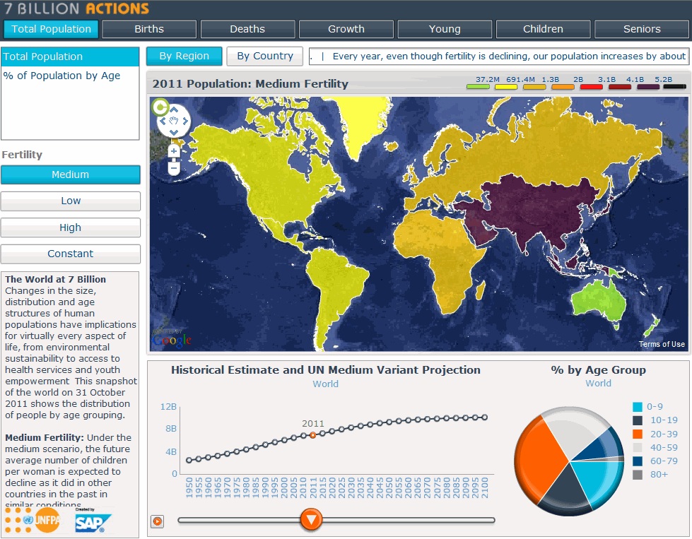
This Halloween, the world will reach a somewhat frightening landmark: a population of seven billion people. As the world's population continues to balloon, it becomes increasingly difficult to divvy up access to resources. It'sa problem that creates an atmosphere ripe for conflict and disaster. The United Nations Population Fund and SAP have teamed up to create an interactive dashboard that allows NGO's, governments, and economists to more easily make funding and resource decisions--and the incredibly detailed widget is open to the public.

The "Snapshots" section of the dashboard provides a broad overview of our population situation, with current statistics and future projections of births, deaths, amount of seniors and young people, and growth in regions and countries around the world.

The "Trends" piece of the dashboard is where it really gets interesting. The section provides all sorts of statistics for countries around the world, as well as the ability to compare them. For example, searching for "Primary Education Enrollment vs. GDP" in Algeria tells us that the country has a higher education rate and GDP than most African countries in 1990, but fast-forwarding through the years tells us that that quickly changes.

Comparisons between different countries can be made by clicking on the blue dots. On this map, we can see that Gabon had a higher GDP than any other African country in the database in 1990--but it still had a lower life expectancy than less well-off countries like Tunisia and Algeria.
The "Trends" dashboard also provides fast facts about different countries. Clicking on Italy, we learn that 16.15% of people with a secondary education or higher are unemployed. In the U.S., 5.95% of people with that level of education lack employment
These dashboards are more than just diversions; until recently, the information that they display was only available in scattered spreadsheets owned by governments, schools, and agencies. Now that it's centralized and easy to visualize, policy wonks can really get to work on grappling with a rapidly-growing population.
[Image by Flickr user Blmerch]