School Leadership 2.0
A Network Connecting School Leaders From Around The Globe
Why Schools And Hospitals Should Be More Like Theme Parks BY Nick de la Mare
Why Schools And Hospitals Should Be More Like Theme Parks
UNDERSTANDING HOW DESIGNERS CREATE THEME PARKS COULD HELP US REIMAGINE OUR MOST IMPORTANT SOCIAL INSTITUTIONS.
WRITTEN BY Nick de la Mare
Fast Company
Almost a decade ago, I started designing services for theme parks, a job that’s harder than you might think. It takes extraordinary effort to make theme parks believable. To be believable, they must be immersive. To be immersive, they must be technologically sophisticated. But make them too sophisticated, and they’re no longer believable. The best theme parks use technology as a means to an end, freeing visitors to become joyously lost in the moment. They feel simple, intuitive, and magical. Understanding how theme parks enchant visitors could help us redesign some of our most important social institutions—like hospitals, schools, and other environments—that have become mind-numbingly tedious.
Immersive worlds have a rich history. From the municipal parks of Frederick Law Olmsted to the World Expositions to modern-day theme parks, examples abound of aspirational utopias that let you travel without leaving home. Technology has always figured prominently in creating a theme park’s fantasy. Think about the 3-D rides at Universal Studios and the optical illusions and animatronics at Disneyland’s Haunted Mansion. Today, technology is also being used to improve some of the more mundane aspects of an amusement park’s experience, so that the magic doesn’t stop when you climb off the roller-coaster.

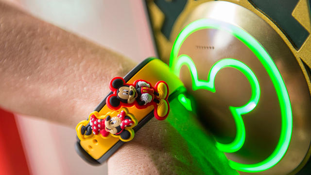
Tens of thousands of people have already used My Disney Experience, a system that includes a booking engine and mobile app to create and modify plans at Walt Disney World Resort in real time, as well as an electronic wristband called the Disney Magic Band to avoid lines, automate payments, and have personalized interactions with Disney characters and rides within the park. The goal of Disney’s system, and others such as Vail’s longstanding RFID ski passes, is to remove logistical obstacles to the enjoyment of the things the visitor is really there to see.
THE ANATOMY OF A MAGICAL EXPERIENCE
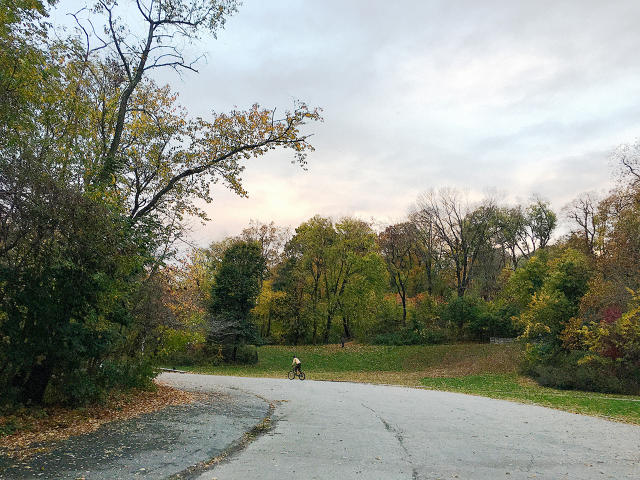
So what does a well-designed environment look like? Varied rhythms are key—you need enough to engage you but not so much you get exhausted or stressed out. Think about what guided one of the original "experience designers," Frederick Law Olmsted, who created Central Park in New York City and the Emerald Necklace in Boston. Olmsted had a knack for arranging natural scenery to create a sense of mystery and discovery, which drew people in and ushered them smoothly through a space. More than a century later, his work influences Disney parks, where the park architects mix "decompression zones" in with the attractions to let people rest before finding something new to explore. A careful observer may notice that the middle sections of many Disney buildings are fairly plain, saving the ornate details for the corners. It creates a kind of visual friction that draws your eye and sparks curiosity. It can be seen as a kind of greeble—the model maker’s trick of adding non-essential surface details—to add a bit of novelty and visual intrigue, and to keep you moving.

Visitors also respond well to an experience that feels like a good story—it has a clear beginning, middle, and end. Common types of digital technologies can create this kind of narrative in the physical world: a sign-up and booking engine before you start your journey, a wayfinding tool when you’re in the thick of it, and a way to capture and relive your memories later, or pick back up where you left off. Something as simple as the "impromptu" dance party that takes place at the end of the Minions attraction in Universal Parks creates a sense of celebration to the experience the Guest has just had, and primes them for experiences to come. (The way Uber also books, tracks and then rates drivers when using their service also applies here as well.) The idea is to replace transactional moments that dehumanize visitors with scenes and rituals that feel important.
HOSPITALS AND SCHOOLS: THE HAPPIEST PLACES ON EARTH?
The technologies and narrative devices common at theme parks could be easily applied to other institutions. Consider the hospital or medical clinic of the near future. While you don’t expect to have fun visiting one of these places, you do at least hope to avoid being overwhelmed, bored, annoyed, confused, or frightened. Taking a "guest-first" approach, in the parlance of the theme park industry, the hospital offers a computer system that, through a series of encounters, gets to know you, and across visits remembers you and your medical history. It allows the hospital to route you through an experience that feels relatively stress-free, intuitive, supportive and, most importantly, centered around you. Logistics like transportation are orchestrated for you, redundant administrative tasks are minimized, and doctors and nurses have information at their fingertips that helps them put your care first. Something that is typically cold and impersonal becomes simple and human, not just while you’re in the building, but before and after your visit, within the larger context of your personal health.
Education is another area where expertly managing the experience is critical. As with healthcare, the physical location, the campus, is only part of the story. At Big Tomorrow we worked with The University of Texas Rio Grande Valley (UTRGV) to design a better experience for students who juggle family and work responsibilities and often travel long distances for school. Rather than build a single new, state-of-the-art, centralized campus, we recommended smaller buildings integrated with neighborhoods and community hubs where students could have access to Wi-Fi, group study spaces, childcare services, and areas where they could virtually connect into their classes if they couldn’t make it in person. We also proposed a Wi-Fi-enabled bus system to move people in a timely fashion and allow students to fit family, work, and school into their schedules.
BALANCING TECHNOLOGY WITH HUMAN EXPERIENCE
In each of these examples, new technology has been introduced, seemingly without too much of a "complexity tax" on the user. The trick is to deploy technology strategically and sparingly, since new tools tend to introduce unintended complexities. Look around any public space and you’ll see people absorbed in their devices, attending to a thousand little tasks but arguably not living in the moment. Have you ever struggled with uncooperative GPS to locate your approaching Uber, as empty cabs whisked past you? Like Mickey Mouse as the Sorcerer’s Apprentice in the Disney film Fantasia, we sometimes find that our tools take on a life of their own, making us a slave to them rather than the other way around.

Moreover, with any commercial experience there’s an inevitable tension between putting people first and turning a profit. Who hasn’t grumbled about overpriced concessions and endless ads at a movie theater? A hospital patient may feel similarly overwhelmed by impersonal and bureaucratic processes that seem to serve the health care provider at their expense. Just because we have the technology to do something, doesn’t mean we should.
Particularly with healthcare, we expect that things will not only go smoothly but also quickly—that unnecessary friction is removed from the process. But remove too much friction, and the process becomes unpalatably fast—to the point of seeming hurried, cursory, and impersonal. The key is to use friction points for pacing and transitions, like sign posts on a journey to relieve the user’s anxiety and focus on the important stuff. Thus a hospital would minimize unhelpful friction like complex elevator controls or repetitive check-in procedures, and increase the amount of helpful friction, like spontaneous interactions with staff who greet you by name, support you, and encourage you during your visit.
It seems obvious that reducing complexity and clarifying expectations can create enjoyable, visceral experiences. But an overly simplified experience can be problematic, too. People like to have choices, but not so many that they can’t relax and enjoy themselves in the moment. The designer’s job is to strike that balance. Great design starts by following the rhythms of life and one’s heart. It ends with something that delights, surprises, and even exceeds users’ expectations. Just ask Olmsted.
JOIN SL 2.0
SUBSCRIBE TO
SCHOOL LEADERSHIP 2.0
Feedspot named School Leadership 2.0 one of the "Top 25 Educational Leadership Blogs"
"School Leadership 2.0 is the premier virtual learning community for school leaders from around the globe."
---------------------------
Our community is a subscription-based paid service ($19.95/year or only $1.99 per month for a trial membership) that will provide school leaders with outstanding resources. Learn more about membership to this service by clicking one of our links below.
Click HERE to subscribe as an individual.
Click HERE to learn about group membership (i.e., association, leadership teams)
__________________
CREATE AN EMPLOYER PROFILE AND GET JOB ALERTS AT
SCHOOLLEADERSHIPJOBS.COM
New Partnership
Mentors.net - a Professional Development Resource
Mentors.net was founded in 1995 as a professional development resource for school administrators leading new teacher induction programs. It soon evolved into a destination where both new and student teachers could reflect on their teaching experiences. Now, nearly thirty years later, Mentors.net has taken on a new direction—serving as a platform for beginning teachers, preservice educators, and
other professionals to share their insights and experiences from the early years of teaching, with a focus on integrating artificial intelligence. We invite you to contribute by sharing your experiences in the form of a journal article, story, reflection, or timely tips, especially on how you incorporate AI into your teaching
practice. Submissions may range from a 500-word personal reflection to a 2,000-word article with formal citations.

You need to be a member of School Leadership 2.0 to add comments!
Join School Leadership 2.0